
Recently, Facebook rolled once again out a major overhaul of their Pages – introducing Cover images and timelines to Facebook Pages. Here are a series of posts we have done (and will continue doing) that explores these changes in more detail – the good, the bad and the ugly. The first set of posts focus on the more immediate design needs of some of our clients – what should my cover look like? what should my tab icons look like? How are the new changes going to impact my application. Most of the changes are good ones! Tab navigation has changed (for the better). Your applications and tabs will continue normally. The notion of a default tab is gone (for better or worse). The timeline is here!
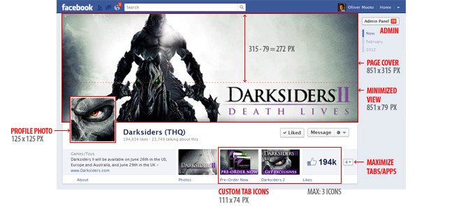
This is what the new Facebook Page looks like. We have included pixel size as a quick reference to those in the process of in the middle of the redesign process. You can check out our best-practice examples and posts below:
Recent Best Practices and Examples Posts:
Other Resources:
- Facebook Pages (Facebook)
- Facebook Pages FAQ (Facebook)
- Facebook Cheat Sheet: Sizes and Dimensions (DreamGrow)
- Facebook Timeline (Facebook)

Not in Music and Entertainment? Then Use This Form!
Lastest 7 Posts in Facebook Category
- Musically Sandbox: Filter Tips / Instagram Filters
- Lionel Richie Mother's Day E-Card
- CB30 Valentine's Day Card
- Lady Antebellum HeartBreak Sweeps
- Metablocks Widgets - Facebook Tab Support
- Application: Mayer Hawthorne's Picture Time (Tag Yourself If you Were There!)
- Resource: Facebook Image Dimensions Cheat Sheet