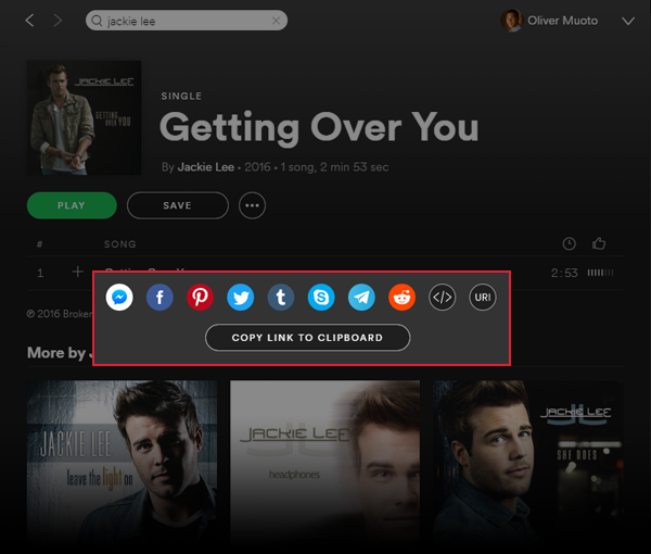
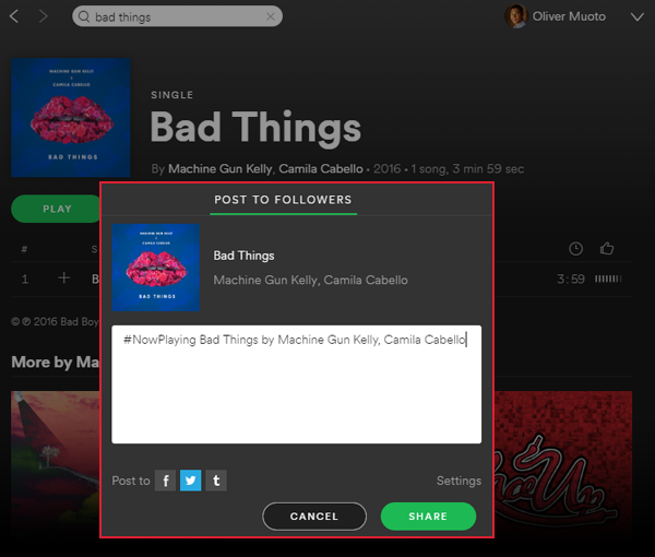
Last Friday we noticed important changes to the Spotify sharing user interface on Windows. Oddly the user interface is back to normal today but we managed to grab a screenshot. It would seem that Spotify is moving away from its more simple 3 social media channels (Facebook, Twitter, Tumblr) approach (see below) to a more comprehensive and robust line up of social media channels that includes Facebook messenger, Pinterest , Skype, Telegram and Reddit. Missing from the sharing drop down menu are Copy (Single) Link, Copy (Single) URI and Copy Embed Code. These have moved to the new simplified sharing dialog box.

What Does This Mean?
This probably means a couple. For a while its has been rumored that Spotify tracks sharing within the application and uses that number in its ranking algorithm. These changes weaken the argument. At Metablocks we have always contended that "sharing" means sharing outside the platform (very few user actually share with other Spotify users within Spotify), these changes seem to support our "sharing out" theory.
Spotify is providing users with more ways to share - more sharing is good! The new user interfaces changes are also more user friendly - moving away from encouraging users to copy URLs and URIs and instead providing more convenient "one-click" sharing options.
What's Next?
As I mentioned, as of today, the user interface is back to the old normal. Perhaps Spotify is in the middle of A/B testing, or perhaps its fine-tuning its design, but more likely that not, this is the future of sharing on Spotify.
The Old Spotify Sharing User Interface
This is a screenshot of Spotify old and familiar sharing dialog that features only 3 social media sharing channels. Sharing to other social media networks required users to first copy the link (URL) for the album or playlist from the sharing drop down in the main menu. Perhaps soon all that will move into a new simplified sharing dialog.

Lastest 7 Posts in Spotify Category
- Postcard Boy - 'Somewhere On A Hillside' Presave Campaign
- Ghost's Halloween Hymns Quiz
- The Brooke & The Bluff: Spotify Quiz Campaign
- Louis Tomlinson #FaithInTheFuture Mosaic
- 5SOS "Stream to Play" Arcade Game (Spotify)
- Nickelback "Those Days" Photo Submission Mosaic
- Lauren Jauregui - #AlwaysLove Cover Reveal
