
Those who have had a chance to play with the New Facebook Pages (see FAQ) will notice that application and tabs have moved from the sidebar to the upper right of the page, under the Page's cover (Also See: Facebook Page)
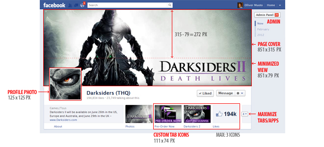
Page administrators can have as many as 3 tab images featured. The rest are available via a drop down menu. From a marketing perspective, these new tab images are a big improvement over the small icons in the previous design. Here are some examples, best practices, and design approaches when it come to the new application/tab icon images:
Key Points:
- The page administrator (not the application developer) is responsible for changing the tab images. You can change the tab icons in the Admin -> Apps (See example) of the page
- You can have as many as 3 tab images (the "Like" is non-functional and can/should be replaced). Click on a tab icon to get a drop down that let's you change its position (See example)
- Custom tab images can be 111 x 74 pixels (but we have found 110×72 pixels works better and is a little more crisp)
Best Practices:
- Combine icons, photos, or images WITH text to reinforce call to action
- Avoid text-only or icon-only approaches if possible (people don't like to read text and not all icons are intuitive)
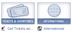
- Take international users/usage into consideration if you are a global brand (consider using icons)
- Consider getting your icons professionally designed (see below)
- Facebook redesign comes with a learning curve! Help users find your application icons through good and perhaps "foolproof" design
Examples:
The Vow: Good use of space, nice balance between icons and text, good choice of icons
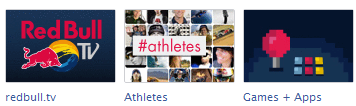
Redbull: These guys always seem to get social media right! Really good choice of graphics. Intuitive, visual, boom! You get it.
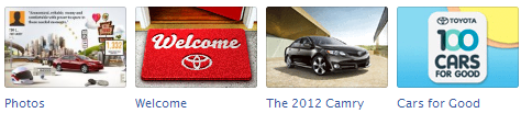
Toyota: You can tell when people pay to have their tab images designed..because they look so good! Excellent mix of intuitive, visual and communicative icons
Sony Brazil: Strong international icons (plus simple tab names)
![]()
UMG: Good use of images and text. Enter to win stuff from Lady Gaga...that makes a world of sense!
![]()
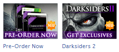
Darksiders: Consider sales/marketing "bursts" (New!, Extra!, Updated!) to draw attention to tab icons. Otherwise good use of graphics
Macy's: Another example where the icons look professionally designed. Excellent use of text, graphics and images!

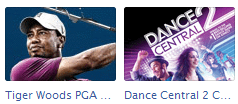
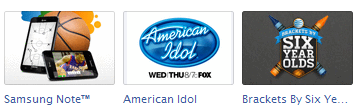
Microsoft Xbox: Mapping products (games) to tabs is a good way to go for some brands, but images should be immediately identifiable (as they are in this example)
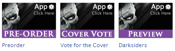
Demos: Use of photo and text where icons don't make as much sense. "Foolproofing" by reinforcing "Click Here" call to action
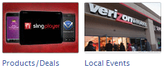
Verizon Wireless: Use of photos can work well for some brands, but one needs to be careful not to use generic images (see below)
AT&T: Another professionally designed example
Nespresso: Decent design with good use of logo and products
Not So Good (Bad) Examples:
Here are some less-than-perfect examples that you can still learn a lot from - either things NOT to do or ideas that can be improved on.
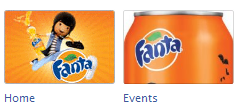
Fanta: Repeat of logo, poor connection between images and tabs. What does a can have to do with events?
Good icon/text combination, good contrast (but potentially boring)

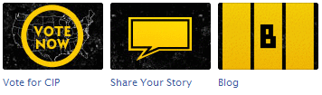
Livestrong: Good branding but icons could be improved, would also make sense to add text. B is not universal icon for blogs!
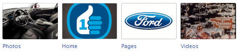
Ford: Poor choice of icons creates for non-intuitive navigation. You can't tell photos from videos, home icon doesn't make sense and why put the Ford logo on a pages tab? Counter-intuitive!
Castleville: If you HAVE to use text, this may be the way to go - at least use a big unique font and a background image. Example of "foolproofing" but can be improved

Johnson's Baby: Wow, any idea what's behind these tabs? A line-up of similar and generic images defeats the point of good navigation (might as well have images of kittens)
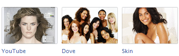
Dove: Same problem as Johnshon's Baby..can you say "worst practicies"
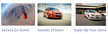
Chevy Sonic: Example where using a photo (of the same car) is NOT a good idea
Lastest 7 Posts in Facebook Category
- Musically Sandbox: Filter Tips / Instagram Filters
- Lionel Richie Mother's Day E-Card
- CB30 Valentine's Day Card
- Lady Antebellum HeartBreak Sweeps
- Metablocks Widgets - Facebook Tab Support
- Application: Mayer Hawthorne's Picture Time (Tag Yourself If you Were There!)
- Resource: Facebook Image Dimensions Cheat Sheet